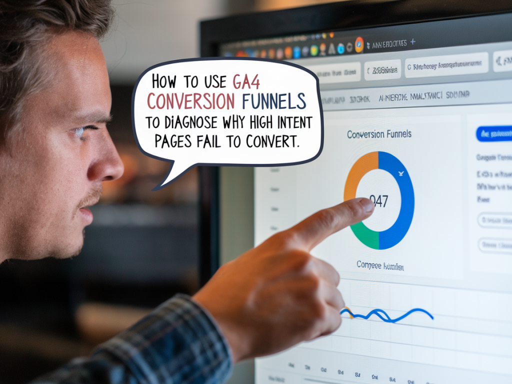
I remember the first time a page with high commercial intent—lots of traffic, good SERP placement, clear CTAs—refused to turn visits into conversions. The analytics looked deceptively healthy: sessions were up, bounce rates acceptable, engagement metrics reasonable. Yet revenue didn't follow. That's when I started leaning heavily on Google Analytics 4 (GA4) conversion funnels. Over time, I've turned those funnels into my go-to diagnostic tool to find where intent evaporates and what to change to recover conversions.
Why GA4 funnels matter for high-intent pages
High-intent pages (product pages, pricing pages, demo request pages) attract users who are already close to making a decision. But the final steps—form completion, add-to-cart, checkout—are fragile. GA4's funnel exploration gives you a visual, flexible way to trace user journeys, quantify drop-offs, and segment behaviors across devices, traffic sources, or user cohorts.
Unlike Universal Analytics, GA4 events-first model lets you define funnels based on actual events and properties, not just pageviews. That subtle shift is critical: it exposes the micro-interactions (scroll depth, button clicks, form interactions) that often determine whether intent turns into action.
Setting up the right events and conversions
Before building funnels, I always audit events. If you don’t capture the right micro-conversions, your funnel is blind. Here’s my checklist:
If you haven’t instrumented form interactions, modals, or AJAX-driven add-to-cart actions, GA4 will underreport. Use GTM’s Element Visibility, Click, and Form Submission triggers. I sometimes add a small dataLayer push on form success to capture server-side confirmation, which reduces false positives caused by front-end quirks.
Building a funnel exploration that actually diagnoses problems
When I create a funnel in GA4, I follow a diagnostic pattern rather than a literal path. The goal is to test hypotheses about where friction appears.
Example funnel steps for a contact/demo request flow:
What to look for in the funnel visualization
Once the funnel is built, I scan three areas:
Common patterns I’ve seen:
Segmenting to find the root cause
Segments are where GA4 funnels become powerful. I always apply these slices:
For example, if mobile users drop off after clicking the CTA, I’ll reproduce the flow on multiple mobile devices and check real-user recordings from tools like Hotjar or FullStory. Often I find either a hidden form, viewport issues, or a JavaScript error—errors that GA4’s DebugView or the browser console will reveal.
Using path exploration and segment overlap
Funnels are great for linear diagnosis; path exploration complements them by showing where users go before and after steps. I use path explorations to spot detours: users clicking FAQ links, checking product specs, visiting the T&Cs page, or opening chat windows. These detours can indicate missing information that prevents commitment.
Segment overlap helps identify behavioral clusters. For instance, a segment of users who view pricing and then visit the support page before leaving may indicate pricing clarity issues.
Quantitative signals to prioritize fixes
Not all drops warrant immediate dev time. I prioritize using:
I add these signals into a short table when presenting findings to stakeholders:
| Metric | Why it matters | Action priority |
|---|---|---|
| Drop-off rate at CTA → Form Start | Indicates immediate UX or tracking problems | High |
| Form abandonment after required field | Shows fields that deter users | Medium |
| Device-specific conversion rate disparity | Potential compatibility or layout issues | High if mobile traffic is large |
Debugging and validating fixes
Once I identify a likely cause, I validate with a mix of qualitative and quantitative methods:
Fixes should be small, measurable, and reversible. After implementing a fix, I monitor the same GA4 funnel weekly and compare historical windows to ensure lifts are real and sustained.
Tips from my experience
Here are practical things I keep in my toolbox:
GA4 conversion funnels are more than charts: they’re a microscope on intent. When you set them up with care, segment smartly, and combine them with qualitative validation, they reveal the exact step where customers change their minds—and how you can stop that from happening.